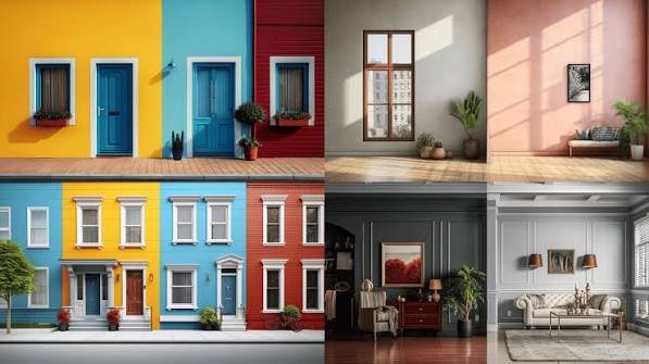
Standing in a paint shop with forty shade cards in your hand is its own special kind of stress. You picked something that looked gorgeous on the tiny swatch, took it home, painted a wall, and… it looks nothing like what you imagined. Sound familiar?
Learning how to choose paint color isn’t about having “good taste.” It’s about understanding a few practical things — light, room size, undertones, and what the space is actually used for. Get those right, and even a budget paint job looks intentional. Get them wrong, and even expensive paint looks off. In this guide, I’ll walk you through room-by-room thinking, not just generic color theory, so you can actually pick something you won’t regret in six months.
Why Choosing the Right Paint Color Feels So Hard
Choosing paint color feels harder than it should because swatches lie. A 2-inch chip under fluorescent shop lighting behaves completely differently once it’s on a 10-foot wall in your bedroom at 7pm.
Quick answer: Paint color looks different at home than in the shop because of lighting, wall size, and surrounding colors — always test a sample patch on your actual wall and view it at different times of day before committing.
There’s also the sheer number of options. Walk into any Asian Paints or Berger showroom and you’ll find 1,500+ shades. Nobody can mentally process that many choices, so people either freeze up and go with safe white, or they pick impulsively and regret it later. I’ve done both, honestly. Neither approach is great.
The other issue is that most of us are choosing colors in isolation — one room at a time — without thinking about how it’ll look from the next room, or how it’ll photograph, or how it ages over three or four years of Indian summers and monsoons (yes, humidity does affect how paint reads over time).
Understand Natural Light Before You Pick Anything
This is the step almost everyone skips, and it’s the single biggest reason paint jobs go wrong.
North-facing rooms in India get cooler, bluish light most of the day. South-facing rooms get warm, strong light. East-facing rooms are bright and warm in the morning, dim by evening. West-facing rooms do the opposite. The same shade of blue can look calm and cool in a south-facing living room but almost cold and sterile in a north-facing one.
Here’s a practical way to test it:
- Paint a sample patch (at least 2×2 feet, not a tiny swatch) directly on the wall
- Check it in the morning, afternoon, and after sunset with your regular lights on
- Look at it on a cloudy day too, if you can wait a few days
- Stand at the doorway and look at it from where you’ll actually be sitting or standing most
I’ve noticed that a lot of people test color only in daylight and completely forget that most evenings are spent under warm yellow LED bulbs, which shifts everything toward orange. If your evenings matter more than your mornings in a room, test under your evening lighting too.
Living Room: Balance Warmth With Flexibility
Choosing paint color for a living room is trickier than other rooms because it has to work for everything — guests, family time, TV nights, festivals, the works.
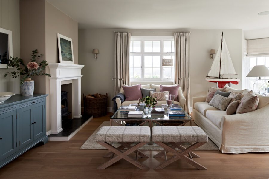
Warm neutrals like beige, warm greige, or soft sand tend to be the safest bet if you’re not sure. They don’t fight with your furniture, they photograph well, and they age gracefully. If you want something bolder, an accent wall behind the sofa or TV unit is a good middle ground — you get personality without repainting the whole room in two years when you get bored of it.
A small example: a friend of mine in Jaipur had a living room that faced west and got brutal afternoon sun. She originally wanted a deep teal on all four walls. We talked her into using it on just one wall instead, with the rest in a warm off-white. The room still feels bold, but it doesn’t feel like a cave by 4pm the way it would have with teal everywhere.
Some things worth trying, depending on your style:
- Warm taupe or greige for a cozy, understated look
- Sage green if you want something calm but not boring
- Deep navy or forest green as a single accent wall, paired with lighter surrounding walls
- Terracotta or rust tones, which suit Indian light beautifully and pair well with wood furniture
Bedroom: Prioritize Calm Over Trend
Quick answer: For bedrooms, choose muted, low-saturation colors — soft blues, warm greys, or gentle greens — since these tones are linked to better relaxation and sleep, and avoid bright reds or oranges that can feel too energizing at night.
Bedrooms don’t need to impress anyone. They need to help you sleep. Bright, saturated colors — even ones you love in theory — can feel overstimulating once the lights go off and you’re lying there at 11pm.
Dusty blues, soft sage, warm grey, and muted lavender all work well. If you want drama, put it on one wall behind the headboard rather than surrounding yourself with intensity on all sides. Kids’ rooms are the one exception — a bit more color energy there is fine, and honestly expected.
Don’t ignore your bedsheets and curtains either. I know that sounds obvious, but people paint the room first and then realize their existing curtains clash badly. Pick fabric and paint together if you can, or at least keep fabric swatches with you at the paint shop.
Kitchen: Think Practical, Not Just Pretty
Kitchens deal with steam, oil splatters, and constant cleaning, so the finish matters as much as the color here.
Go for a washable, semi-gloss or satin finish rather than a flat matte — matte finishes soak up grime and are miserable to wipe down over a stove. For color, warm whites, soft yellows, sage green, and terracotta all do well in Indian kitchens, especially with wood or granite counters.
If your kitchen is small or has limited natural light (common in a lot of Indian apartments, especially older ones), lighter shades will make it feel more open. Darker kitchens can look genuinely stylish in photos but tend to feel cramped in daily use if the room itself is small.
Related reading: Interior vs Exterior Paint: What’s the Difference?
Bathroom: Handle Moisture and Mood Together
Bathrooms need paint rated for high humidity — this isn’t optional in most of India, where monsoon humidity alone can cause regular paint to peel or develop mold within a year or two.
Look specifically for moisture-resistant or bathroom-specific paint lines (most major Indian brands have one). For color, spa-like tones work well: soft blues, sage, warm grey, or clean white. Small bathrooms benefit from lighter colors that don’t make the space feel boxed in, though a deep, moody bathroom can look genuinely luxurious if the room is a decent size and well-lit.
Kids’ Room and Study: Balance Energy With Focus
Kids’ rooms can handle more color than adult rooms — soft yellows, light blues, mint green, even a playful coral accent wall. Just don’t go too saturated on every wall, or the room can feel chaotic rather than fun. One bold wall plus calmer surrounding walls usually strikes the right balance.
For a study or home office, cooler tones like blue-grey or muted green are known to support focus better than warm, energizing colors. If you’re setting up a work-from-home corner (increasingly common since 2020, and still true in 2026 for a lot of people), keep the wall behind your video calls in mind too — busy patterns or very bright colors don’t photograph well on camera.
Understanding Undertones — The Step Most People Skip
Choosing the right paint color without checking undertones is how people end up with a “white” wall that looks faintly pink, or a “grey” that reads oddly green in certain light.
Every color, including whites and greys, has an undertone — a hidden secondary color that shows up depending on lighting and what’s around it. Hold your paint swatch next to a pure white sheet of paper. If it looks slightly pink, yellow, blue, or green in comparison, that’s your undertone.
This matters a lot when you’re matching paint to existing tile, flooring, or furniture. A warm-toned wood floor generally clashes with a cool-undertone grey wall — it can look slightly off without you being able to say exactly why. Take a tile or fabric sample to the paint shop with you if you can.
How Room Size Affects Which Colors Work
Quick answer: Lighter colors make small rooms feel bigger by reflecting more light, while darker colors work well in larger rooms or as accent walls, adding depth and coziness without making the space feel cramped.
Small rooms — a lot of second bedrooms or box rooms in Indian apartments fall into this category — generally do better with lighter, cooler-toned colors. Dark colors absorb light and can make a small space feel like it’s closing in.
That said, this isn’t an absolute rule. A small room painted a confident dark color, with good lighting and minimal clutter, can look intentionally cozy rather than cramped. It’s really about how much natural light you have and how much furniture is competing for space. A small, dark, cluttered room is a bad combination regardless of paint. A small, dark, well-lit, minimally furnished room can actually look great.
Testing Before You Commit
Buy sample pots before committing to full cans — most Indian paint brands sell 200ml or 500ml testers for this exact reason, and it’s genuinely worth the extra ₹150-300.
Paint at least a 2×2 foot patch, not a tiny stripe. Do this on two different walls if the room gets different light on each side. Live with it for 2-3 days minimum before deciding. I know that feels slow when you’re excited to get started, but this one step alone probably prevents more repainting than anything else on this list.
Frequently Asked Questions
How do I choose paint colors for an open floor plan? Pick one neutral base color for the connected walls and use accent walls or furniture to add personality room by room. Jumping between totally different colors in an open space usually looks disjointed rather than intentional.
What’s the best paint finish for Indian homes? Satin or semi-gloss for kitchens and bathrooms because they’re washable, and matte or eggshell for bedrooms and living rooms where a softer look matters more than wipeability.
Should ceilings always be white? Not necessarily, but a lighter shade than your walls usually makes a room feel taller and more open. Pure white is the safe default, but a very pale tint of your wall color can look more cohesive.
How many colors should one home have? Most designers suggest 3-5 colors total across the whole house, including neutrals, so the space feels connected rather than like a patchwork of unrelated rooms.
Does paint color really affect mood? Yes, to a real (if modest) degree — cooler colors tend to feel calming, warmer colors feel energizing, though personal association matters just as much as color psychology in general.
How do I know if a color will look too dark once it’s on the wall? Paint tends to look darker on a full wall than on a small swatch, an effect designers call the “60% rule” issue — always go one or two shades lighter on the sample if you’re unsure, since it’ll read darker at full scale.
Final Thoughts
Choosing the right paint color really comes down to slowing down enough to test properly — light, undertones, room size, and how the space actually gets used all matter more than trend charts or Pinterest boards. There’s no universal “right” answer, only what works for your specific room, in your specific light, for how you actually live in it.
If you’re about to start a paint project, don’t skip the sample-patch step, even if it costs you a few extra days. Grab two or three testers this weekend, paint some patches, and just live with them for a bit before you commit to gallons of anything.